Designing Based on Your Color Personality
Do we have a color personality? Renowned artist Henri Matisse was quoted as saying, “With color one obtains an energy that seems to stem from witchcraft.” Color can exert an almost magical effect on perceptions, mood, creativity and even behavior. And it’s a powerful tool you can leverage when designing your personal space to generate an outcome that you find not only more beautiful — but are more comfortable, productive and happy spending time in.
Color Personality
Every individual has a color personality — one that extends beyond a favorite color and speaks more to the overall quality, intensity and types of shades that generally appeal to you. Do you favor color palettes that are vivid or subtle, clear or muted, warm or cool? Do you prefer a high-energy dynamic environment, or more subdued surroundings subtly adorned with delicate hues?
The Lemon Drop Test
This informal test has been used to assess introversion and extroversion. It’s performed by applying a small amount lemon juice to the tongue and measuring salivation. Psychologists predict introverts will produce more saliva than extroverts on the lemon drop test due to a higher state of reactivity and central nervous system arousal — and this is precisely what happens. In short, this theoretically occurs because introverts are more sensitive to intense perceptual stimuli than extroverts.
This may explain why extroverts can find intense social interactions invigorating when introverts feel overwhelmed. And the same may well apply to color stimuli, with introverts becoming overstimulated and uneasy in intensely colored environments, where extroverts might be more energized and uplifted by them. Note how you feel in intensely colored versus subdued spaces and take that into account when applying color to your surroundings.
3 Properties of Color
By understanding the three characteristics of color, you can manipulate them to create a palette — and environment — that suits your color personality.
- Hue: The warm to cool undertone of a color (terracotta vs. fuchsia)
- Value: Relative brightness and darkness of a color (lavender vs. eggplant)
- Saturation: Color intensity from muted to clear (sapphire vs. slate)
Colors perceived as intense tend to be warmer, darker and/or more saturated. If you find a paint color too strong, for example, you could:
- lighten it
- desaturate it
- cool down the undertone
Palettes to Suit Your Personality
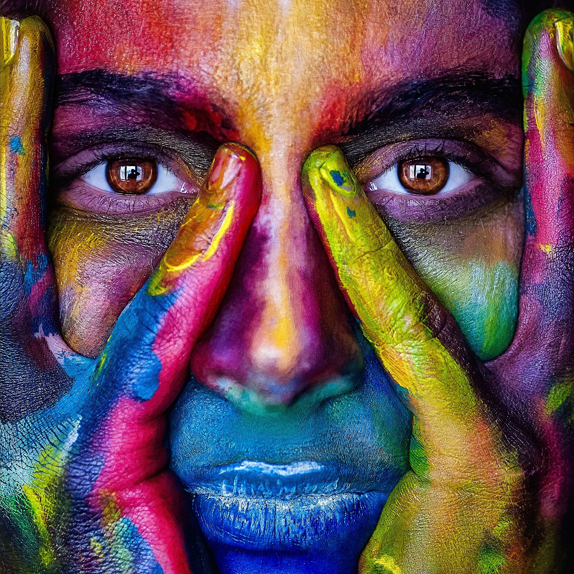
Additional factors that impact color personality emerge when we experience colors in combination. A color wheel represents the relationship among colors. Hues directly across each other are complementary (e.g., green and red, blue and orange) and will appear more intense together, potentially making such pairings more appealing to color extraverts. Analogous shades are adjacent to one another (green, blue and purple) and appear more harmonious, which a color introvert might feel more comfortable around.

geralt (CC0), Pixabay
Contrast in value (light and dark) also affects the perceived intensity of color combinations. Even a monochromatic color scheme with shades ranging from pale jade to dark forest green can create tremendous contrast , despite the fact that everything in a space is basically green. More contrast = more intensity = potentially more attractive to a color extrovert.
Putting it all to use: Color Strategy in Design
Beyond a simple color scheme, a color strategy speaks to the deliberate and calculated selection and placement of colors within a space, taking an individual’s aesthetic preferences and color personality into account. Here’s how these principles might be put to use for a color introvert vs. extrovert.
Blue room color introvert design strategy:
- Paint walls a pale sky blue, toned down with a touch of gray.
- Select an even lighter blue for the ceiling instead of white to reduce contrast with the walls and create a more serene environment (besides, painted ceilings are awesome).
- Mix in shades of jade or lilac for a calming analogous color scheme.
- Reserve more vivid azure or turquoise for jewel tone pops of color in art and accessories
Blue room color extrovert design strategy:
- Use navy or peacock blue for paint or other large design elements.
- Consider bright cobalt or cerulean shades for drapery fabrics, rugs and other significant pieces.
- Pair blue with an orangey complement to amp up the impact.
- Punch up the contrast level for greater drama by setting off indigo walls with a glossy white floor and metallic accents.
Color Me Happier
When it comes to selecting color for your home, don’t blindly follow trends or emulate what you see in shelter magazines. If you design to your own taste and color personality, you can walk in the door at the end of the day into a personal retreat — a space that lifts and rejuvenates your spirit and inspires you to live well in it. In the end, the right design decisions are always the ones that are right for you.
Sources
http://www.bbc.com/future/story/20160420-what-can-a-lemon-tell-you-about-your-personality
https://www.psychologytoday.com/us/blog/modern-minds/202108/the-lemon-test-introverts-are-more-aroused-extroverts